Don’t Stick a Fork in It
by Bradley Rubenstein
Ron Gorchov: Double Trouble
P.S.1 Contemporary Art Center
22-25 Jackson Ave [@ 46th Ave], Long Island City, NY, 718.784.2084
http://www.ps1.org
Through September 18
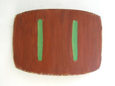
 Lure II, 1976, oil on canvas, 36" x 51" c 14"
“I respected him right up until I slit his throat.”
Truman Capote, In Cold Blood
Ron Gorchov is one of those really respected artists that only the Mid-West seems to produce. Respected, as in Jim Nutt respected or Leon Golub respected. Gorchov was born in Chicago in 1930, attended the University of Illinois (my alma mater), and began exhibiting in the late 1950s. Gorchov’s style paralleled that of artists like Frank Stella or Ellsworth Kelly. These three artists contended with the potential in the shape of a canvas to not only contain the painted image but also to give the painting itself form. Hybrids of Abstract Expressionism and 60’s Minimalism, his paintings were cool, interesting, and then largely forgotten. The art world is like that. Although his work has only been exhibited once before in New York, Gorchov has maintained a sort of following; artists like Guy Goodwin and Ellen Phalen owe him a huge debt.
The shaped canvases [generally two vertical parallel lines centered within rounded rectangles] have been compared to electric sockets, riding saddles and shields. I read that in the press release. I also read that he paints the floating shapes in the center of the canvases ambidextrously. The right one is the right handed side, the left etc…. I was oddly struck by these factoids. I was intrigued both by the ambidexterity, and, ironically, the lack of any discernable “hand” in his various marks. In a strange way Gorchov painted himself so much into the painting that he eventually painted himself out of the picture. Since the incredibly cloying work in the Elizabeth Murray retrospective, I don’t want to be told that a shaped canvas is supposed to look like, you know, “a shoe!” It struck me that until I read that these paintings were meant to look like something, I had never really noticed that they were shaped in any particular way. The pieces seemed bent to fit the space in the way that the paint bent to fit the canvas, the way he must have bent to make the mark. Really this is work to be looked at, felt and moved through.
If these paintings resemble shields (a favorite motif, it seems, among the Chicago guys; see Golub, Goodwin, et. al), maybe it is because this type of work ultimately needs defending; there is a delicacy to it that is belied by the size of the pieces. These paintings provide a private pleasure. Really good paintings don’t have to be seen by everyone to still be really good paintings.
Regardless of whether Gorchov faded from prominence by his choice or from critical and/or commercial neglect, the artist is brought back into the light by the current exhibition. Gorchov’s paintings prove to be both vintage and retro simultaneously which, considering that the focus of P.S.1 has been so much about newness lately, is sort of, well, cool.
witty, concise, eurdite, and possibly good-looking. what more could one want from an art critic?
ReplyDeletejerry saltz