Brad Said
Brad said I shouldn’t call this a blog. “Blogs are so…you know. Try calling it a porn site.”
Welcome to my porn site.
I started writing on art on the heels of the ’93 Whitney Biennial, so it’s only fitting that I resume on the heels of the current Biennial.
Tit for Tat
Whitney Biennial 2006: Day for Night
Whitney Museum of American Art, 945 Madison Ave [btw. 74th & 75th Sts.], 212.570.3633. http://www.whitney.org/
Closed
 Someone called it the Post-America Biennial. It would be better to call it the Post-Traumatic Post-Op TransAmerica Biennial. That would be more like it. There is no Post-America.
Any pretense of art world globalization principally centers on an extended jet set of art professionals and collectors; all the work and the people are essentially the same—it is a traveling show that has the gesture of universality with none of the bitter aftertaste. Although jet-setting is far more accessible than it once was, insofar as I am tethered to this bedrock, I prefer the notion of grasping the global through the local. As the Senator from Massachusetts once said: “All politics is local” —even art politics.
Now that the notion of a themed biennial has been introduced, I’d like to propose a few of my own:
1) The Hierarchical Biennial: The Bucksbaum Award is a start, but I want a real judged show in which the exhibiting artists are pitted against each other in various hard and soft categories. Prizes are awarded by jury and, hold your nose here, the public!
2) Video-Free Biennial: Why not? We’ve already had painting-free biennials.
3) All Local/All World Biennial: Artists who come from somewhere: live/work in the Metro-area, America or truly international destinations, i.e. Westchester, Wisconsin or Ghana, who execute work of their place—not pale imitations of art mag art.
4) All Women Biennial: Isn’t about time? Besides, then we wouldn’t have to hear about the dearth of women artists in the Biennial until the following Biennial.
5) All People of Color Biennial: Ditto. [Except no fair recycling the usual suspects. There are other people of color in the world besides those Thelma Golden discovered.]
As for this one….
My favorite professor of gallery administration stresses that if you are going to curate a themed exhibition, you should shape your theme to the works and not vice versa. Ok, so right away they fucked that up.
The 4th floor played the theme day for night as black for white [and gray]. The first space off the elevator featured Uri Fischer’s busted room, The Inelligence of Flowers, which contains another piece of his, Untitled (branches), an inexorable aluminum slowly rotating and dripping wax and a large b&w painting by Rudolf Stingl, Untitled (After Sam) [what’s with all these untitled pieces having titles?]. Together the works make for a handsome gallery—something that might work well as a Helmut Lang showroom. Next to that Dan Colen’s heavy for light pseudo-cement pieces sort of reminded me of the clothing Santino did for Project Runway: long on personality and ambition, short on actually delivering the goods.
The 3rd floor seemed to interpret day for night as good for bad. Individual artists were called on to show their best and the worst pieces respectively. Hannah Greely contributed a good and then a bad sculpture:, Last Stand, a hat rack made of bones was at once raw and touching while her other piece, Silencer, beat the tired fucked-up baby sculpture trope firmly into the ground. Mark Grotjahn did some good, funny white on beige geometric abstractions: White Butterfly, White Butterfly, and Yellow White Butterfly [all Untitled, naturally] and then, like a suitor who picks his nose at the key moment, Grotjahn lost my heart before he gained it by also displaying Blue Face Grotjahn. I don’t care that he generally paints his abstractions over this kind of gestural expressive romps—he’s wise to paint over them: we don’t need to see them.
Lisa Lapinski’s self conscious Nightstand should have been included on the good/bad floor, the best and the worst of the artist was embraced in one piece. The oversized night table had brilliant drawers that folded out in waves. T’were beautiful. Unfortunately Lapinski didn’t feel that such formal invention was enough. She had to go and add “content” like msg to the mooshu—she junked it up with a with a bunch of crap too banal to list.
The second floor seemed to play out day for night as good for bad behavior with Billy Sullivan’s slide show leading the way displaying the now seemingly innocent [good] bad behavior of yesteryear [70s etc.] Although Sullivan also continued the good art/bad art trope with some bad full portraits paintings of his own. Further on, in a display of the kind of stunning racial insensitivity that only Europeans can still muster, a bunch of black artists were stuck together in one room [toward the back] along with displays of Ku Klux Klan and white supremacist themed art. Get it? Day for night/whites for blacks? “Only zees time Phillipe we will do ze theme in a racial way—it is brilliant! N’est pas?”
Otherwise, other trends stumbled along. Along the female photographer front, let us hope and pray that Hanna Liden is the last entrant in the semi-clad teen girls in the woods genre—less a milieu these days than a millstone. Conversely, Angela Strassheim’s photos show us something we might want to see again: the pristine rapture of a born again family going about its life. Ann Collier’s Cover [California Girl] was cool but the rest of her photos were predictable concept-y stuff: photos of record covers—covers of covers. Ugh.
Finally, it was amazing, but in all honesty there were no videos worth dallying over except Pierre Huyghe’s handsome meditation, A Journey That Wasn’t. Paul Chan’s 1st Light did a lovely job evoking the long shadow that Marcel Duchamp cast over this show via The Bride Stripped Bare…. But really did we need an entire room of recreated Duchamps by Sturtevant? Aping Duchamp is not the same as being Duchampian. No one here was. Or maybe…
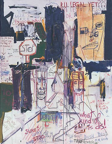
In the spirit of resurrecting defunct notions of good and bad [or in the hopes of being Duchampian], I give u RU Legal? by Miles Davis. A rumor had been floated that the work was really a hoax perpetrated by David Hammons. Had it been so, the piece would most certainly have taken “Best in Show” [and “Most Duchampian”] honors. However, although Hammons may have wished he’d done it, the painting, sadly, is genuine [http://servercc.oakton.edu/~larry/miles/main/paintings.html]. Painted in the last years of the legend’s life, RU looks like a teenager’s take on Basquiat. As talented a trumpeter as Davis was, that’s how untalented a painter he was; RU Legal [or RU Legal Yet? as it is titled in the site above] is the visual equivalent of Michael Jordan playing baseball. As such, and with a heavy heart, I award the painting—“Worst in Show.”
* * *
Inka Dinka Don’t
Inka Essenheigh
303 Gallery, 525 West 22nd St [btw. 10th & 11th Aves.], 212.255.1121.
http://www.303gallery.com/
Closed
For a long time I’ve resisted judgment on Essenheigh [or at least judging Inka from on high]. I’ve also resisted making any references to Jimmy Durante. Now I’ve failed to resist on all counts. I’ve withheld judgment because I didn’t want to be hating on her just because she gets to do big fun looking paintings and sell them for lots of money while the rest of us have to work for our suppers. Now I can hate on her for more than that.
These recent paintings are straight assembly line canard. Each canvas is coated uniformly in its own tasteful background color right around the edges. Images are painted on top generally from dark to light building up imagery straight out of the computer-generated playbook—there may even be a shortcut for these particular distortions: oddish tableaus of figures in situ melting, drooping or swooping into and through each other to no particular end. These things aren’t even as fun to look at as most of Essenhiegh’s earlier extreme abstractions. Kudos to the curatorial machinations behind this show though. The least of the works Inka crinked out is hung alone in the back room beneath a fabulous skylight. By showcasing the thinnest and most under-painted [and not good under-painted] work in the exhibition, the gallery tries to spit shine the turd and pass it off as gold. A gutsy gambit but we’re not buying.
* * *
Glücklich BuenaVista
Lucky DeBellevue
Feature Inc, 530 West 25th St. [btw. 10th & 11th Aves.], 212.675.5772.
featureinc@feautreinc.com
Closed
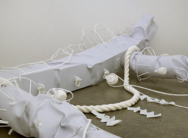
First of all his name is too good. Second of all they’re pipe cleaners not chenille stems…ugh. In spite of that and in spite of never really being terribly moved by the work—I am moved by the work. These simple sculptures each humbly and movingly play on the nature of the support; the pieces literally and heartbreakingly address one of the fundamental issues of sculpture by replacing classic armatures with canes, crutches and showers stools. In one piece, Cuirass, three clear minibike half-torso shields surround a green chenille blob of a drooping heart. Though less about support than protection, Cuirass reveals the vulnerability at the soft center of DeBellevue’s work. His pieces, barely able to stand up for themselves, nevertheless manage to do just that with the help of the artist’s strong and loving embrace.
For this exhibition, the gallery’s usual policy of group shows only [except for Tom Friedman] hurts the work. Hemmed into too small a space, the sculptures seemed crowded and diminished thereby. For this show the paintings, even DeBellevue’s charmingly slight 2D affairs, are the things that you bump into. DeBellevue’s work needed and deserved room to lean. Lean on Lucky!
Life is short. Art is long. You never know.
artholes!
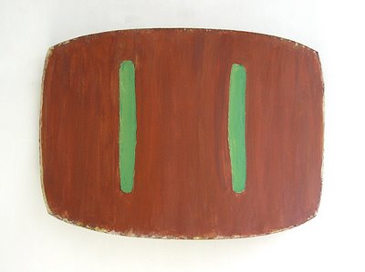 Lure II, 1976, oil on canvas, 36" x 51" c 14"

